
Evolution of an Entry
Hi lovely readers! Kyle, the design side of New Minimalism here to share the evolution of my apartment's entry.
Let's face it, first impressions are important. A warm smile or firm handshake may set the tone for interactions, but at home, your entry is the first impression.
Your entry should welcome you back into your home, back into your own place of respite and rejuvenation. Taking the time to improve your entry benefits you every time you cross your threshold; when you open your front door you immediately feel at home and at ease.
Even if you are renting, you can take some simple actions to make your home welcoming first and foremost for yourself, but also for others.
When we first moved in, my partner Johnnie and I embraced the white walls of our entry. But after some time, we realized a few things:
- The dismal hallway in the building which leads up to our apartment was soul-sucking and depressing (and reminiscent of The Shining).
- Parking our bikes in the hall closet (and the inevitable bumps and bangs associated with large objects in small spaces) resulted in a number of scuff marks on the walls.
As such, we basically came to understand that our entry hallway was a perfectly bite-sized opportunity to infuse some fun and personality in our space, and counter effect the dark and dingy hallway of our building.
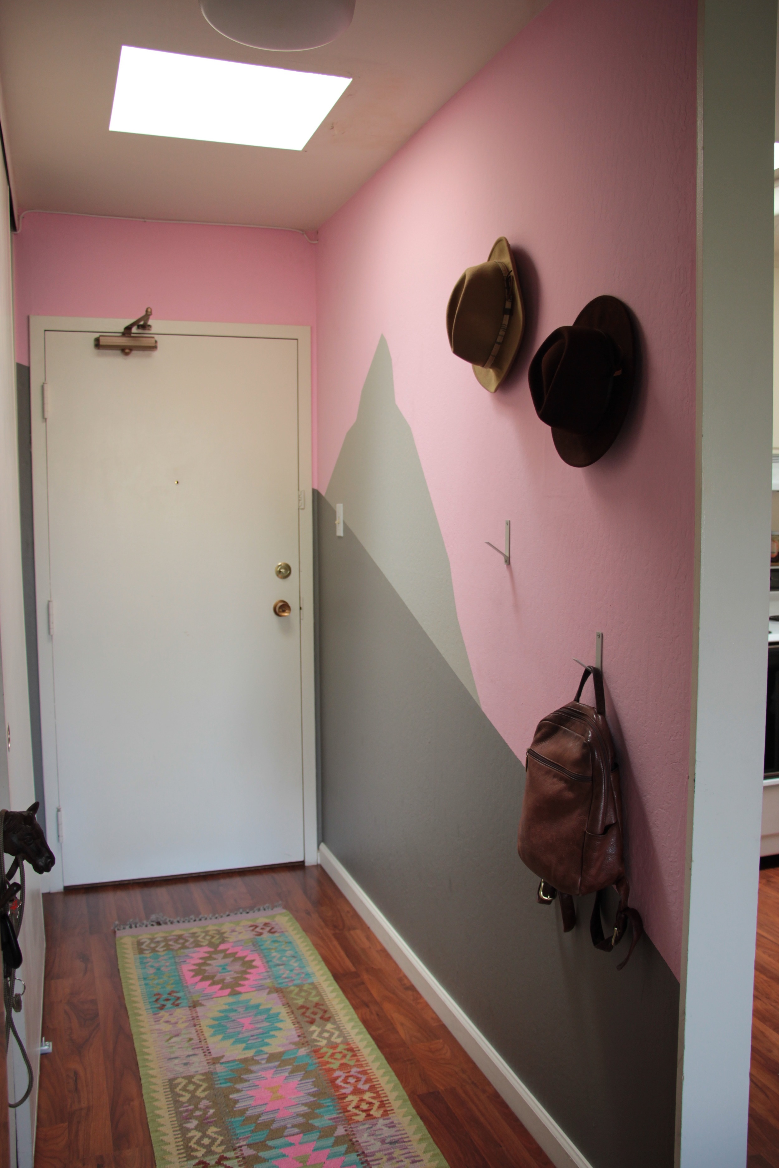
When we first started thinking of ways to improve the hallway, our goal was simple: to make it “really fucking cute.” I had already painted a pink accent wall in the apartment, and thankfully Johnnie was on-board with the pink action. We decided to start there. PINK! Pink….plus…some other color. Our 70’s-style apartment come pre-appointed with dark brown and burnt orange accents. We are already pretending that the burnt orange countertops don’t exist, so what about dark brown?
Thankfully Johnnie noted that pairing pink with dark brown was too much like the Neapolitan ice cream of our youth. So gray it is!
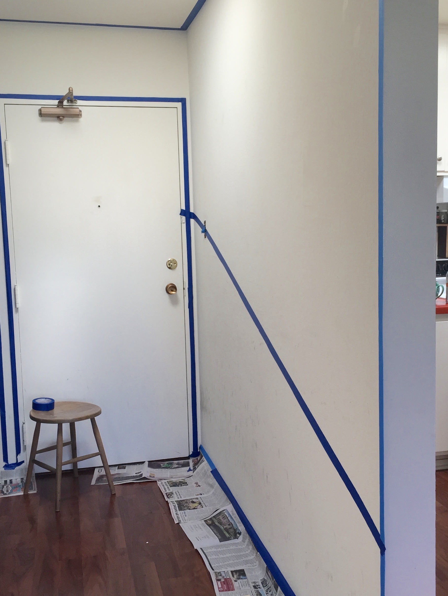
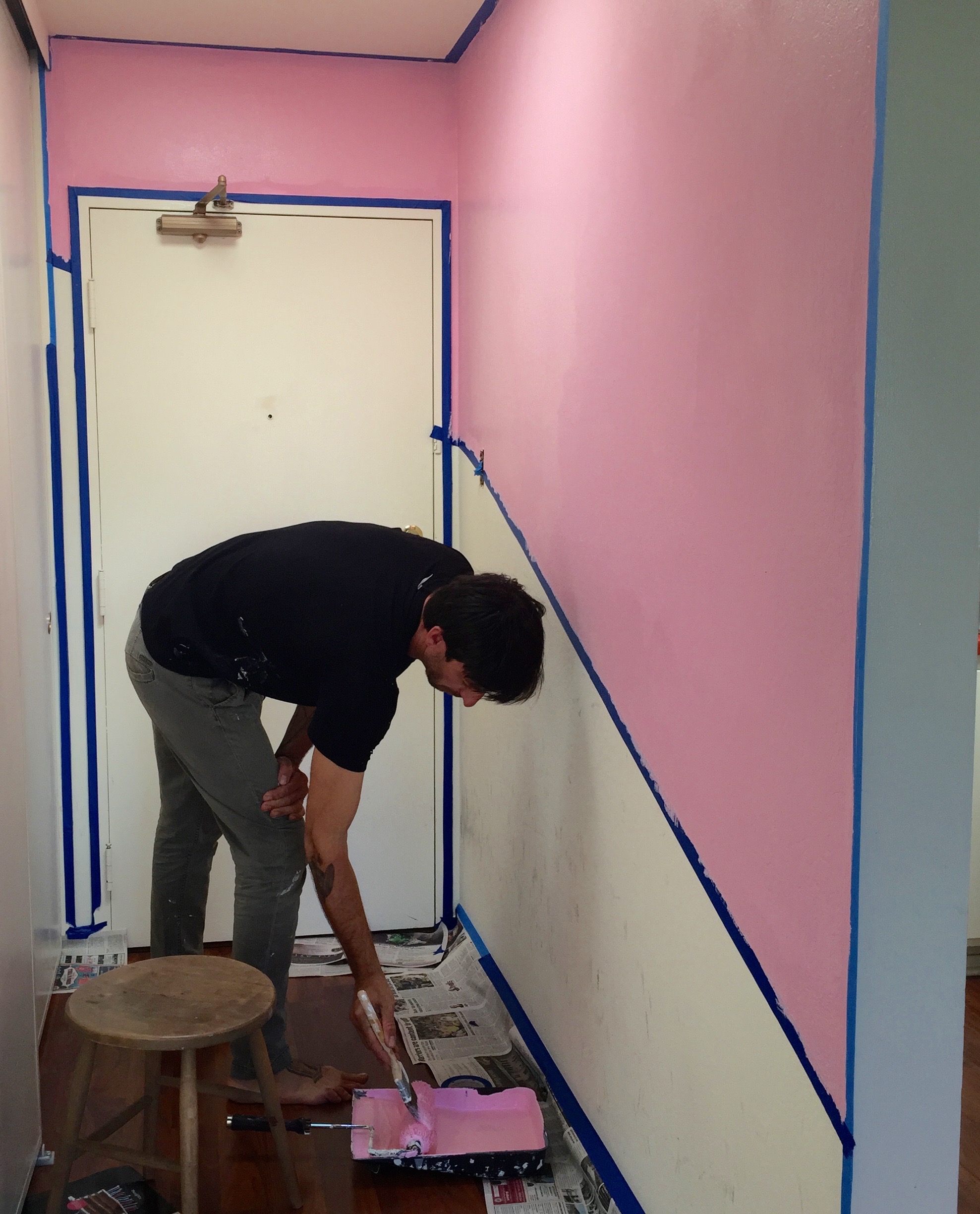
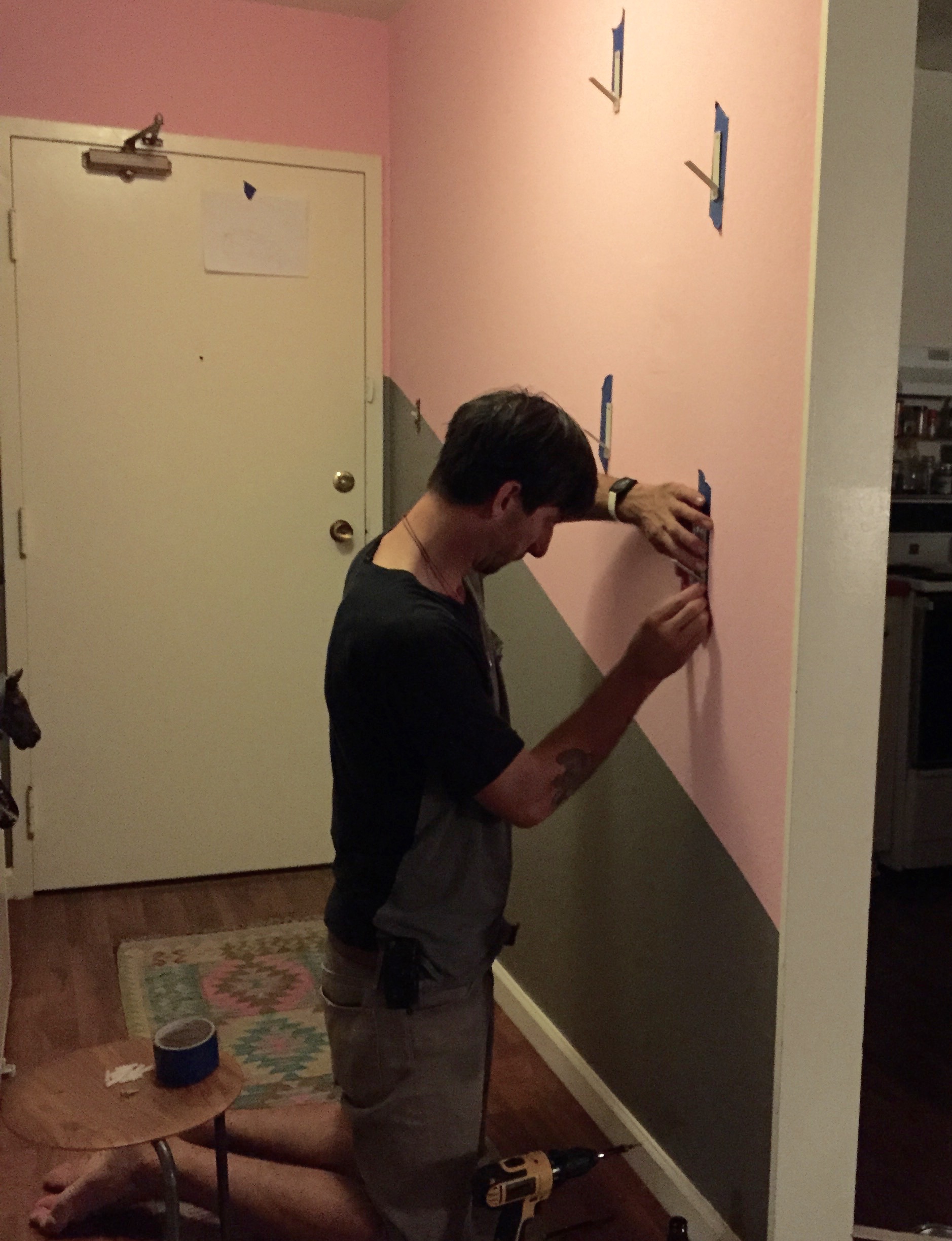
We chose to put the gray on the lower half of the wall to cover those scuff marks, placing it on an angle to give it more interest.

During a big trip last summer, Johnnie and I found this amazing and uniquely-colored Afghani runner in Copenhagen (of all places) and added it to the mix.
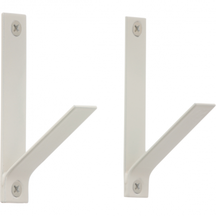
After what felt like hours of online sourcing, we found these modern and sturdy hooks from Horne.

Then Johnnie painted the numbers on our door pink, leaving the "C" alone, to remind us of our humble roots. One friend said the effect makes the numbers look like candy - yes! We loved it. Our experience of walking through the door was improved 200%.
Yay, the entryway is complete!
Or is it...?
As the months went on, something seemed to be missing from the space. Although it was, in fact, "really fucking cute," it wasn't totally singing for me. And don't get me wrong, I wasn't losing sleep over the matter. But I did have the urge to continue designing the space.

Image previously hung in my entry.
I originally added a beautiful image by the photographer Lindsay Hile, but it didn't have the desired effect. The entryway is a place to pass through, and the photo was hard to see, nor could it be fully-appreciated.
Then another friend at random told me about a monochromatic mountain scape she saw painted on a wall, and I realized we could do that in our hall, essentially enlarging and incorporating the idea of the photograph into the actual wall.

So it was decided to add another gray layer to the wall to create a mountain mural.

Ta-da! The finished result. Entering our home has turned into a complete joy. It feels totally reflective of us.

AND NOW IT FINALLY FEELS COMPLETE.
But who knows, maybe next year it will be navy.